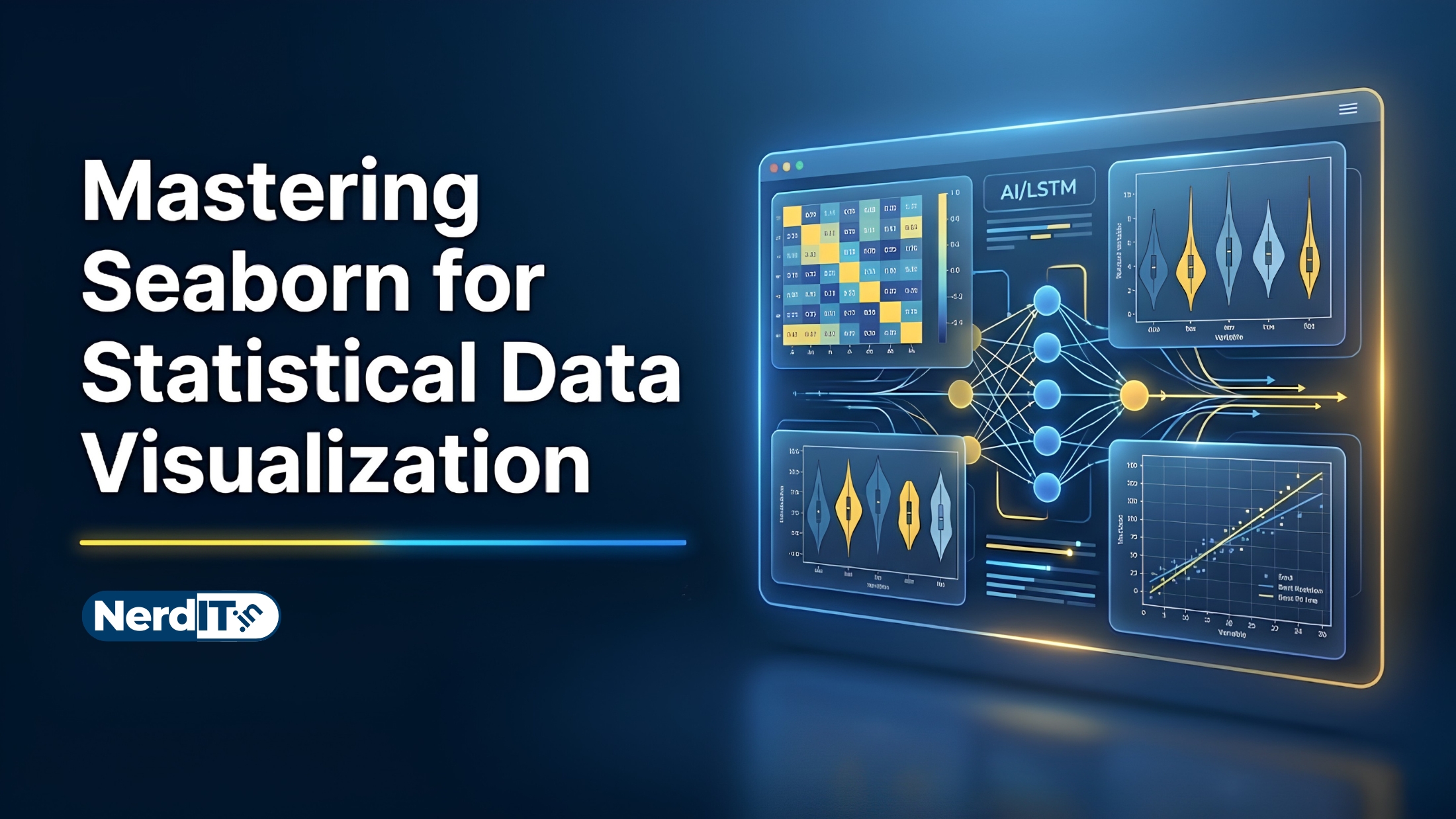
Mastering Seaborn for Statistical Data Visualization
Learn how to create powerful and visually appealing data visualizations using Seaborn. Explore statistical plotting, customization techniques, distribution analysis, categorical charts, heatmaps, and real-world data storytelling workflows used in modern data science and analytics.
What's Included
16
Lessons
4h 43m
Duration
Certificate
What You'll Master
Skills and outcomes you'll walk away with
Introduction to Seaborn
Python Data Visualization Fundamentals
Setting Up Seaborn Environment
Understanding Datasets
Distribution Plots
Relational-Plots
Course Curriculum
16 lessons • 4h 43m total
Introduction to Seaborn
Python Data Visualization Fundamentals
Setting Up Seaborn Environment
Understanding Datasets
Distribution Plots
Relational-Plots
Categorical Data Visualization
Matrix and Heatmap Visualization
Pairwise and Multivariate Visualization
Styling and Customization
Statistical Analysis With Seaborn
Advanced Visualization Techniques
Real-World Applications
Expert-Level Topics
Tools, Libraries, and Ecosystem
Capstone Projects and Portfolio Building
Certification Path
Certification Exam
48 multiple-choice questions • 70% passing score required
Final Project: Comprehensive Data Visualization and Storytelling with Seaborn
<p>In this final project, you will apply everything you have learned in the <em>Data Visualization with Seaborn</em> course to perform a comprehensive Exploratory Data Analysis (EDA) and create a compelling data narrative.</p><h3>Step-by-Step Instructions:</h3><ol><li><strong>Dataset Selection:</strong> Choose a real-world dataset of interest (e.g., from Kaggle, UCI Machine Learning Repository, or a public API). The dataset should contain a healthy mix of categorical and numerical variables to allow for diverse visualizations.</li><li><strong>Data Preparation:</strong> Load your chosen dataset using pandas. Handle any missing values, perform necessary data transformations or feature engineering, and properly format the data for visualization.</li><li><strong>Exploratory Data Analysis (EDA):</strong> Create at least five different types of Seaborn plots (e.g., scatter plots, box plots, violin plots, heatmaps, count plots) to uncover underlying relationships, distributions, and trends in the data.</li><li><strong>Advanced Visualizations:</strong> Utilize advanced Seaborn functionality such as FacetGrids, PairPlots, or JointPlots to demonstrate multidimensional relationships. Apply custom color palettes, adjust contextual themes (e.g., sns.set_theme), and ensure all plots have professional titles, axis labels, and legends.</li><li><strong>Data Storytelling:</strong> Compile your code and visualizations into a single, cohesive Jupyter Notebook. Use Markdown cells to explain your methodology, interpret what each plot reveals, and summarize your final actionable insights in a concluding section.</li></ol>
Verified Certificate
Earn a verified PDF certificate with unique verification ID upon completion • ₹299
Related Courses
More free AI & Data Science courses with verified certificates
 Mastering Linear Regression: Theory & ImplementationBeginner
 Mastering Random Forest AlgorithmsIntermediate
 Mastering Matplotlib for Professional Data VisualizationIntermediate
 NumPy: The Core of Numerical ComputingIntermediate
Reviews & Ratings
No reviews yet — be the first!
Free
Free course — learn at your own pace
Certificate: ₹299
Verified Certificate
₹299 — pay only to certify
- Unique verification ID — provably genuine
- Shareable & ready for your LinkedIn profile
- Verifiable by anyone, anytime on our verify page
- Learn 100% free — the certificate is optional